This represents the goddess of Night, Nyx. This is my mom, and I had her sit by the rocks and set the long exposure on my camera to 30 seconds. I like it a lot because the stars really stand out and you can tell it's Night but it's also light out and you can see "nyx's face." I had her gaze up at the sky because it looks like she's observing the night sky, as she brought it on.
Tuesday, March 30, 2010
Greek Myth- Nyx
This represents the goddess of Night, Nyx. This is my mom, and I had her sit by the rocks and set the long exposure on my camera to 30 seconds. I like it a lot because the stars really stand out and you can tell it's Night but it's also light out and you can see "nyx's face." I had her gaze up at the sky because it looks like she's observing the night sky, as she brought it on.Wednesday, March 24, 2010
Greek Myth- Athena
 My greek myth was athena. In the story, Athena was said to be the guarder of the city because she planted the first olive tree, and the people respected her for that. I had her stand in front of the city to represent that, and in front of the water to represent Poseidan because she had fights with poseidan. She was also an expert at spinning and weaving, and the necklace represents weaving. Athena was also said to be very pure and innocent, so the white dress represents that.
Thursday, March 18, 2010
Modern to Antique- Gavin

This is my antique photo. Overall I think it looks like an antique compared to how it looked before in color. To get this effect, we used the gaussian blur, filters and the paintbrush.
Wednesday, March 17, 2010
Planet-time
 This is my planet. I took this during the sunset by my house. I rotated it so it would look smoother and you wouldn't be able to tell where the line was where they connected.
St. Pattys

This is my St. Patty's photo. I really like the raindrops on the plants, it adds detail and uniqueness. I desaturated the background and then erased the green plants so they stood out, and then i did the lomo effect on it.
Friday, March 12, 2010

Thursday, March 11, 2010
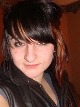
PORTRAIT- Vanessa

This is Vanessa. I thought it would be an interesting point of view when it's close to her face and her hair is in front. It also explains her personality a bit because she is always happy and crazy and this photo explains it somewhat. I also dodged her eyes and changed the hue a bit so they would pop out more.
PORTRAIT- Emily

This is emily. I took a picture of her in Waukesha and I added a neon glow to make her look warmer, I dodged her eyes and then I gaussian blurred the background to make her the focus. I also dodged part of her hair to bring out the blonde and lighter parts.
Thursday, March 4, 2010
Portrait- Lauren

This is my sister Lauren, and probably my favorite one. Her turqoise shirt really contrasts with the warm tones of the ground and trees, and her eyes accentuate those warm tones. I used a gaussian blur and then erased her so she would be the main focus.
Portrait- Eliana

This is Eliana, I love her eyes in this picture, they popped out and make that the focal point of the image. I used a neon glow on this and it made it look warmer, which compliments the sun on her hair and lighting on her face.
Portrait- Brian
 This is my cousin brian, I like how his eyes really pop out and match his shirt. This is my least favorite photo, just because of the expression on his face. I had to photoshop the words out of his shirt, so that's one thing I think I could have done better with this photo, but I like how the background is less saturated because it makes the focal point his eyes.
Portrait- Vanessa
 One thing i wish would have been different with this photo is her eyes. They are so dark and they don't pop as much as I would like them to. I thought the point of view was interesting though, and would make for a different looking portrait. I used a neon glow on this to bring out the warm tones and accent the yellow Vanessa was wearing.
Friday, February 26, 2010
Color Psychology- Green

Green represents life and energy almost, so I took a picture of a green pine tree branch, which also could show how even in winter when almost all of the plant life dies, there is still green and liveliness.
Color Psychology- Yellow

This picture represents the color yellow. Yellow signifies happiness and energy, so I took a picture of my sister laughing to represent the yellow. I then put a neon glow over the image to emphasis it.
Color Psychology- Blue

Blue represents sadness, peace or calmness. I used a neon glow with blue as the main tones and then put a soft light on top to give the whole image a blue feel. I also changed her eye color to add to the effect of sadness.
Color Psychology- Red

This picture is at a park, one of those swirly things the kids play on. I used this because the swirling of it could represent energy, and red normally represents energy, whether it might be anger, passion, etc. It also works for attraction, because the color red attracts people, this might apply to the kids and was meant to attract them to the park.
Yellow Wallpaper
 I used this photo for the yellow wallpaper assignment because it reminds me of the woman in the story. She is always in that room and never really gets out, so she is trapped, hence the vines. The color i chose was darker, gray tones because to me it can mean depression, loneliness, or just blank, nothingness.
 Friday, February 19, 2010
Repulsive Number One.

I used this picture as repulsive because people will normally put a label on graffiti by saying it is made by gang members or troublemakers. People see it as negative and vandalism. And although sometimes it is, it can be seen as artwork and have a very strong message. It can convey something that the person is feeling that may be important to them. I think with all the colors and lines, graffiti is an awesome way to show art and express yourself, it's just another way to do that. I love looking at it and seeing the different styles. I used the color balance adjustment layer, and it really seemed to bring out the green and give it some contrast.
Repulsive Number Two.

I used this as a repulsive because when you look closely at the pine tree branch, it looks gnarly and dirty with much detail. It almost looks like a dead crayfish skeleton. The more you look at it, the more it looks attractive, when you pay attention to the detail. The colors are really brought out by the sunlight and there is contrast between all the details. I used the color balance adjustment layer, and then used the contrast layer to bring out the warm colors.
Attractive Number One.

I used this picture as an attractive image because these sap cones have a very interesting yellow/greenish color and it really stands out in the winter. I believe it is repulsive in the summer, the sticky sap cones fall off on the ground, and then when i'm running around barefoot they stick to my feet and clothes and leaves marks! They are a nuisance, but when you look at the true beauty of them they don't seem as repulsive. I used the color balance adjustment layer on this and it brought out the yellow and gave it a warmer tone.
Attractive Number Two.
 I am using this picture for attractive because when you look at ice and thorns in the sun they can look very beautiful with their colors. It can be seen as repulsive because thorns are normally a brown color that isn't very pretty, and they are also prickly and you can scratch yourself on them. Ice can also be seen as repulsive in the winter time, it causes accidents, is very slippery, and when it melts and is mixed with dirt and salt, can be very mucky and gross. Overall, how the sun captured the ice and color of the thorns makes it look attractive. I edited this picture by using the color balance adjustment layer.
Friday, February 12, 2010
Individuality
 This montage represents individuality. I decided to pick individuality because it is a strong topic that I believe other people take for granted. I think we all should realize that everyone is an individual and is different in their own way. I used the background of two different photos of trees to represent the individuality of trees; they all look different and are unique to each other, but are the same. The pine tree is another example of individuality, it's individual to the other types of trees. I put Vanessa on the left side because she is an individual and it represents how each person is different in many ways. My sister Lauren on the right is another example of that. The leaves represent how they all look the same and have intricate details but are different in their own way. The eyes are another example of that and show how everyone truly is an individual.
Hope.

This is my montage titled Hope. I decided to use Hope as my second topic because it is a big part of my life and a characteristic that means something to me. I started out with cutting eliana out and placing her in the field with the flowers. She is holding her arms up to signify hope, or waiting, being positive. I put the big plant of the flower on the left to add contrast and detail. The hands behind Eliana represent how things can change, and we just need to have hope with those things. The wall and window represent how when you have hope, you have to look through the window instead of staring at brick wall, or think positive. The sky represents that hope is endless and you can always have hope. I put the sky on top of everything except eliana to create depth and add color to the image.
Tuesday, February 9, 2010
Easy Blur
 I chose this photo for the easyblur because there are many different layers and details on the leaves and applying the blur softened it and made the macro setting more prominent. I also applied the hard light effect to the layer to enhance the contrast with the leaves and their layers.
Neon Glow
 I chose this picture to do the neon glow with because i thought it would bring out her face compared to the dark background and the colors in her hat. I picked the color yellow and then put the overlay effect on top of the neon glow, to give her face a almost painting-like look. I really like how it turned out and I think it's an interesting effect that can make other photos look neat.
Feather

I chose this photo for the feather and brush strokes filter because i thought the macro picture of the flower would look good with this effect. I used the Gaussian blur and ink outlines under the brush strokes effects. I think it looks interesting with the small outline around the details on the leaves and gives it an edgy look.
Blur/Overlay
 I chose this photo for the blur/overlay filter because I thought the contrast between the windows, the white and the building would really pop out. Also, it gives it a nice glow that looks good with the winter setting.
Monday, February 8, 2010
Day to Night
 These are my day to night photos. The one on the top is obviously the one i changed to night, and i dodged the lamp on the right to make it look like it is darker and the lamp is on.
Tuesday, February 2, 2010

Monday, February 1, 2010
Space Assignment

I used the road because i thought it would work good with the linear perspective and adding objects to the image. My favorite part of my montage is the butterflies. I used the car on the left for my retro object. The butterflies and the hitchhiker are my organic shapes. My geometric objects are the two huts way in the background. The sunflowers have radial symmetry. The deer sign and the bus stop have negative space. My object of choice is the bus.
Subscribe to:
Posts (Atom)